Dashboard of people in the company

This dashboard provides a detailed view of the employees in the organization.
You can view either the current situation or go back to historical data.
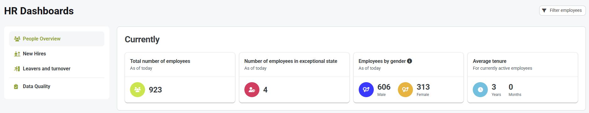
In the header, you will find the following indicators:
- Total number of employees - shows the number to date
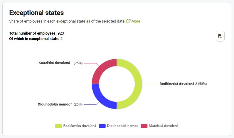
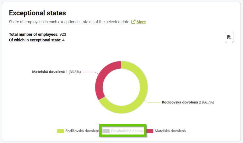
- Number of employees in an emergency situation - this includes people who are currently not working, e.g. employees on parental or maternity leave or long-term sick leave
- Employees by gender - the 2 most common genders are displayed here
- Average length of employment - shows how many years employees stay with the company on average
Charts
By default, the graphs display values for the current date.
There is a filter above the graphs that you can use to view data for any specific day.
Data are displayed back to 2020, if available.
Only employees who are active on the selected day are included in the statistics.

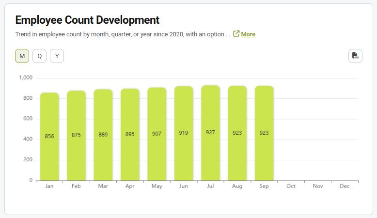
Development of the total number of employees
The graph shows the development of the total number of employees over a certain period.
After applying a filter to a specific date, the data development (total number of employees) for the given year is displayed, with each column showing the number of employees in the given month.
Data can be displayed in several dimensions:
M = month
Q = quarter
Y = year
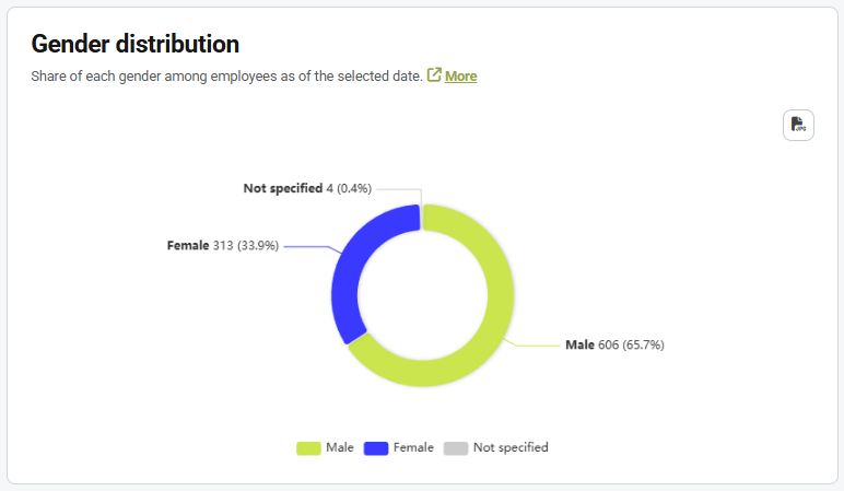
Gender distribution
The graph shows the proportion of each gender among employees on the selected date.
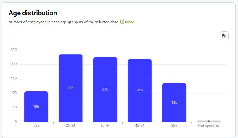
Age distribution
The graph shows the number of employees in each age category on the selected date.
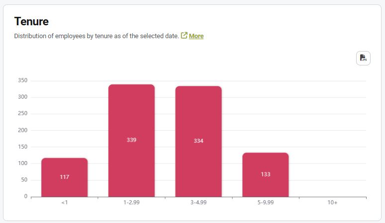
Length of employment
The graph shows the distribution of employees by length of service in the company as of the selected date.
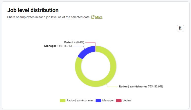
Division by job level
The graph shows the proportion of employees in individual job levels on the selected date.
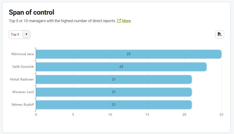
Number of direct reports
The chart allows you to view the Top 5 or Top 10 managers with the highest number of direct reports.
Emergency situations
The graph shows the proportion of employees in individual emergency situations on the selected date.