Dashboard structure

All dashboards have a uniform structure.
The first part is the header , which always displays current metrics, so-called KPIs (Key Performance Indicators).
These indicators serve to quickly assess the situation and may include, for example, the number of starts and stops, turnover or average length of employment.
The header is followed by the second part, which consists of graphs . Graphs visualize data and can have various forms - e.g. column, line, doughnut, etc. Each graph has a button for quick export to JPEG .
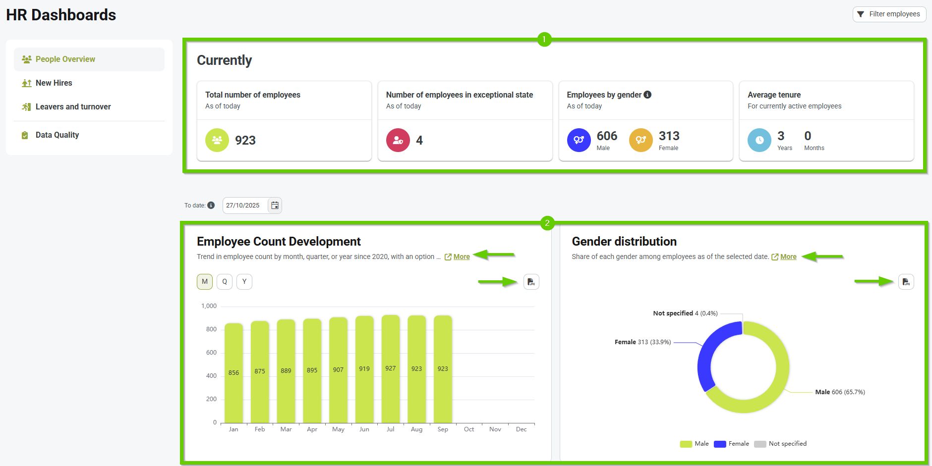
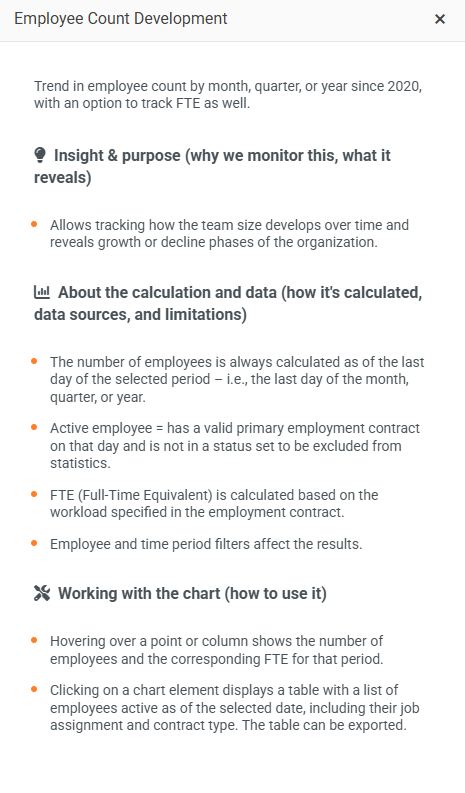
There is also a More button next to each graph - clicking it will open a window with more detailed information, including:
- Insight & meaning – why we watch the chart, what it reveals to us
- About calculation and data – how the chart is calculated, what data it is based on and what are its limitations
- Working with a graph – recommendations on how to work with a graph effectively
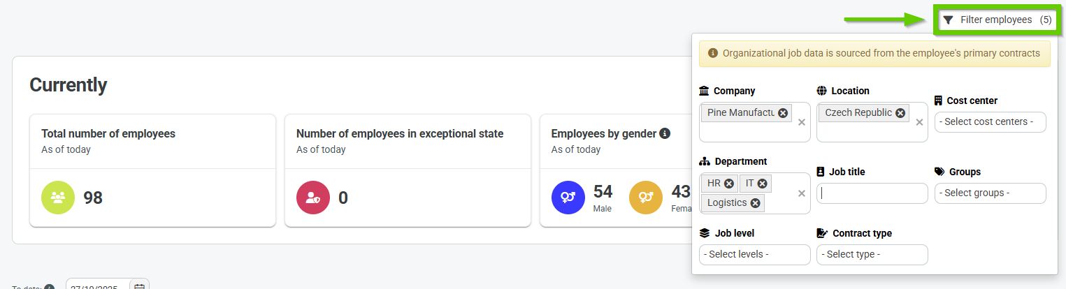
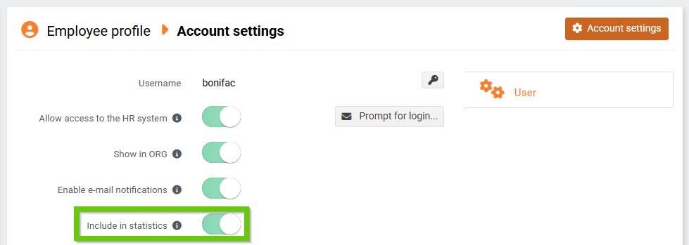
By default, dashboards display data for all users in the system who have their tab set to be included in the statistics . You can further filter these users using the Filter Employees button on each dashboard. After clicking, enter the parameters to search for the desired records. The filter allows you to select multiple values for a single parameter.
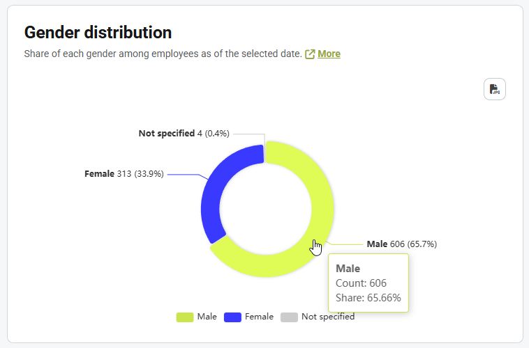
Tooltips display additional information about individual chart elements when you hover the mouse over them.
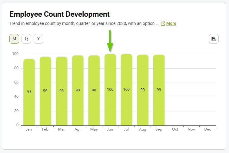
The drill down function is an interactive tool that allows you to explore data in greater depth.
Clicking on a column will display a table with detailed data for the selected time period.
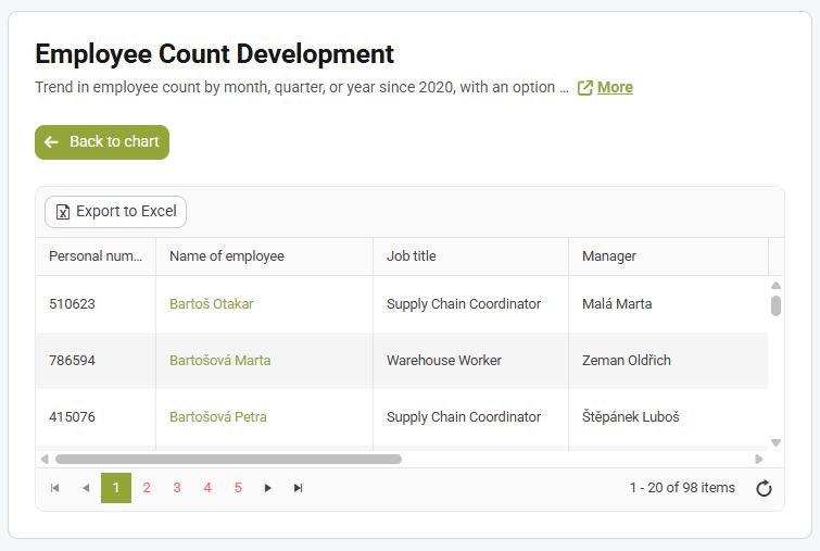
The table can be exported to Excel.