Departures and Fluctuation Dashboard

This dashboard provides a detailed overview of the number of departures and the turnover rate.
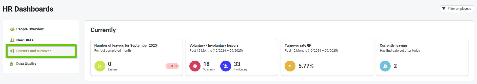
In the header, you will find the following indicators:
- Number of exits for... - shows the number of exits for the last completed month; the widget shows an increase or decrease compared to the previous month
- Voluntary / Involuntary Departures - shows the number of employees who left voluntarily or involuntarily in the last year
- Turnover rate - shows the percentage of employees who left in the last year
- Currently leaving - shows how many people have a departure date set after today
Charts
By default, the graphs show values for the current year and for all types of departures.
However, using the filters above the graphs, you can also view data for another year (back to 2020) and you can also choose which type of departure you want to display data for.
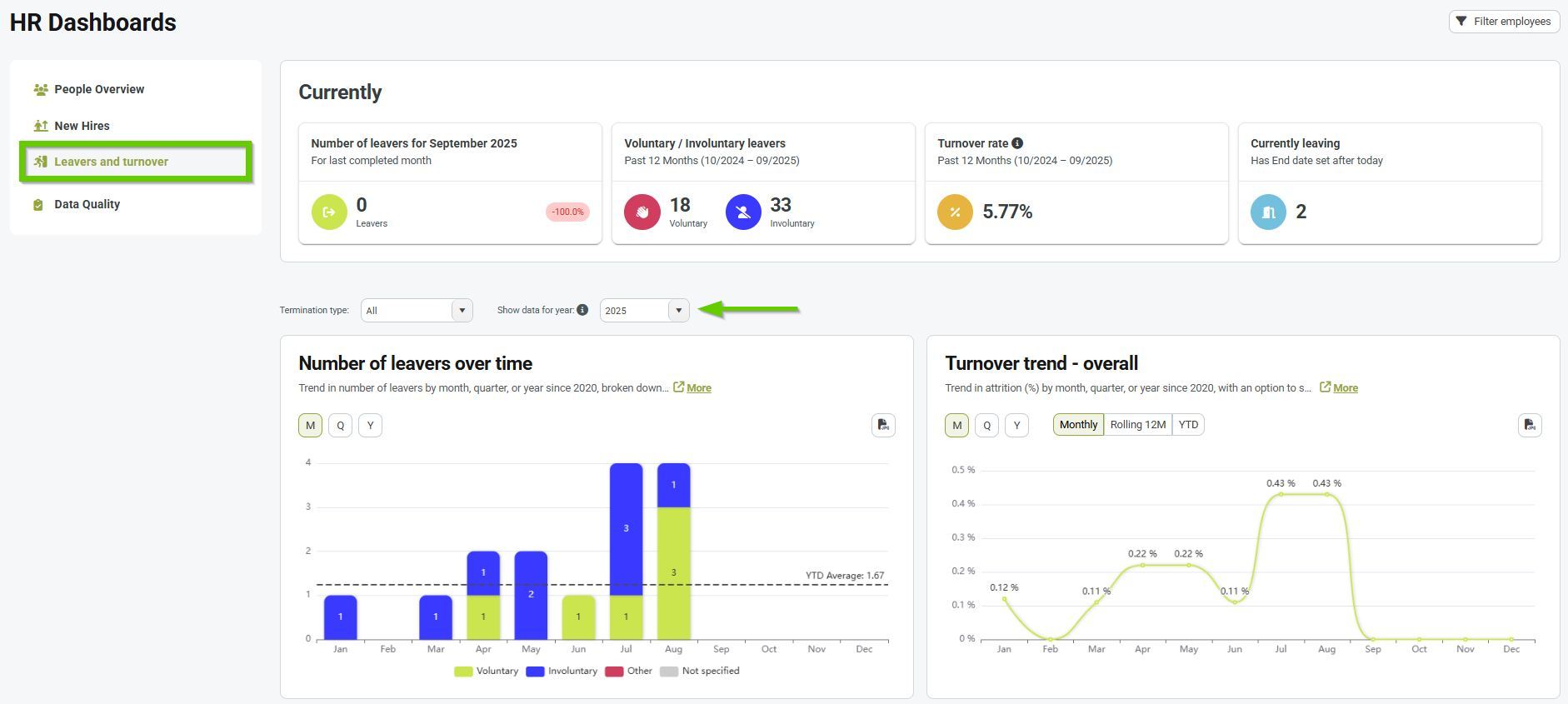
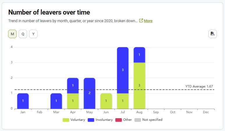
Number of departures over time
The graph shows the number of departures in individual months during the selected year.
Data can be displayed in several dimensions:
M = month
Q = quarter
Y = year
2. You can add the Departure Type attribute with the values Voluntary/Involuntary/Other to the Departure Method code list ; you can refresh your knowledge of working with code lists in the Code List Items article.
3. You can learn why it is useful to track voluntary departures in the article Recording voluntary departures of employees .
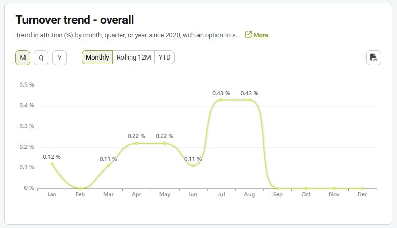
Fluctuation development – overall
The graph shows the dropout trend in percentage.
Data can be displayed in several dimensions:
M = month :
- monthly - shows the percentage of departures only for a given month (can fluctuate a lot)
- YTD - shows the percentage of departures from the beginning of the year to the current month (it is more stable)
Q = quarter
Y = year
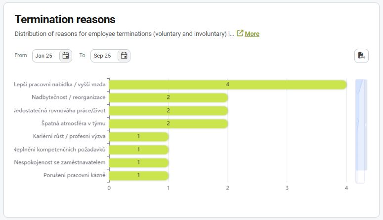
Reasons for leaving
The graph shows the reasons why employees terminated their employment in the selected period.
This chart allows you to narrow down the data within a selected year using the from - to filter.
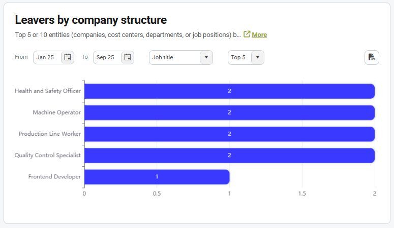
Departures by company structure
The graph shows the number of departures broken down by company structure.
Choose whether you want to view data by:
- company
- centers
- department
- job positions
Also choose whether you want to display the Top 5 or Top 10 entities.
You can also narrow down the dates within the selected year using the from - to filter.